What Tickles Your Pancy? An Interview with Pancy Letter
If there was one art form that was made to last, then it’s safe to say that it is typography. From the streets to the most formal accessories, the technique of arranging type into fine aesthetic is just everywhere. It catches our eyes, it tickles our wit, it pinches a hole into our soul; the art of lettering, with no doubt, is significant and just couldn’t be ignored.
Then we found Carl Graham who took extreme interest into the common yet overlooked kind of typography – the many hand-lettered signage of Manila, usually found on jeepneys, sidecars, and taxis, are what this lad of Pancy Letter took curiosity on. What started as a class project eventually turned into a research full of interesting stories and beautiful typography made by Filipino artists. No, these typesetters do not exhibit their work in galleries but they sure have a bigger space on the streets of Manila. It’s Filipino art on urban form and it’s time we treat ourselves with this visual.
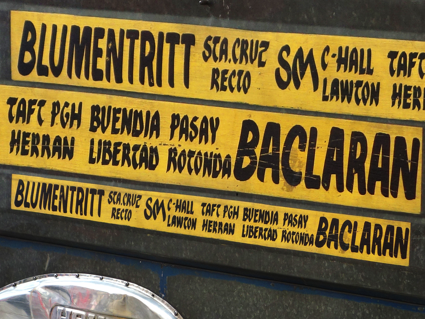
From Basic taxi to Biyaheng Langit and Katas ng Saudi jeepneys, learn more of Pancy Letter in our interview below. Who knows, you might just find your new favorite taxi name here.
Tell us something about Pancy Letter … When and how did it begin?
Pancy Letter began as a Web Design class project under the name “Urban Type Manila” when I was [still] in school at the College of St. Benide. I didn’t want to do the usual “5 Sites of Intramuros” requirement so I asked my professor if I could do the site on another topic if I went out to do the interviews.
And so I went to interview these street lettering artists after asking around where I could find them. The finished site carried on to be my thesis project and then remade it twice with Pancy Letter being the third. It is still incomplete and buggy but I’m okay with how it looks.
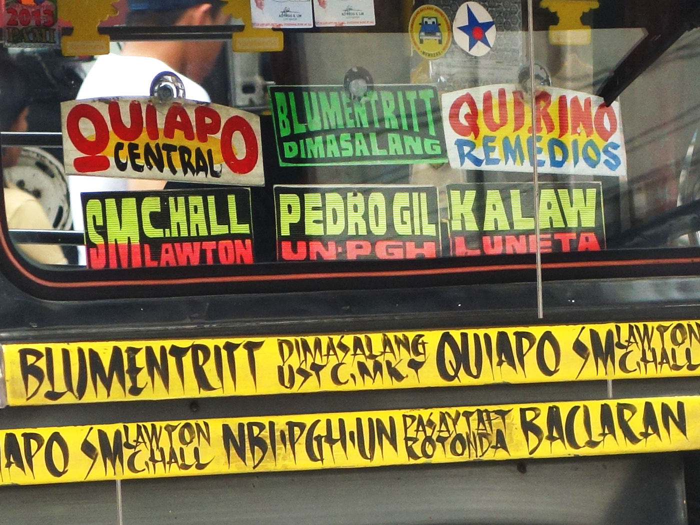
Why change your name from Urban Type Manila to PancyLetter?
Well, for one, my thesis advisers made me change it. But as for why Pancy Letter, there’s a funny story in which you can read in question number five below.
Why take interest on this type of typography?
The rationale behind the project was that I was trying to see if we had a unique voice in graphic design as the Swiss or other nationalities did. I knew there were a lot of talented Philippine graphic designers, who I respect, but it didn’t feel like we had a “local” or “colloquial” style that was unique to us in a graphic design kind of way. Sign-making seemed to be the closest fit even if it isn’t on a digital case.
At first I didn’t like how it all looked based on the lettering styles I saw. But it started to grow on me especially the iconic Aircon sign on script. I would rip a taxi door off an abandoned cab if it had the style I liked. Even the squiggly jeep route and LTFRB’s “How’s My Driving?” letters (pancy letter, as Manong Silverio called them) started to look interesting.
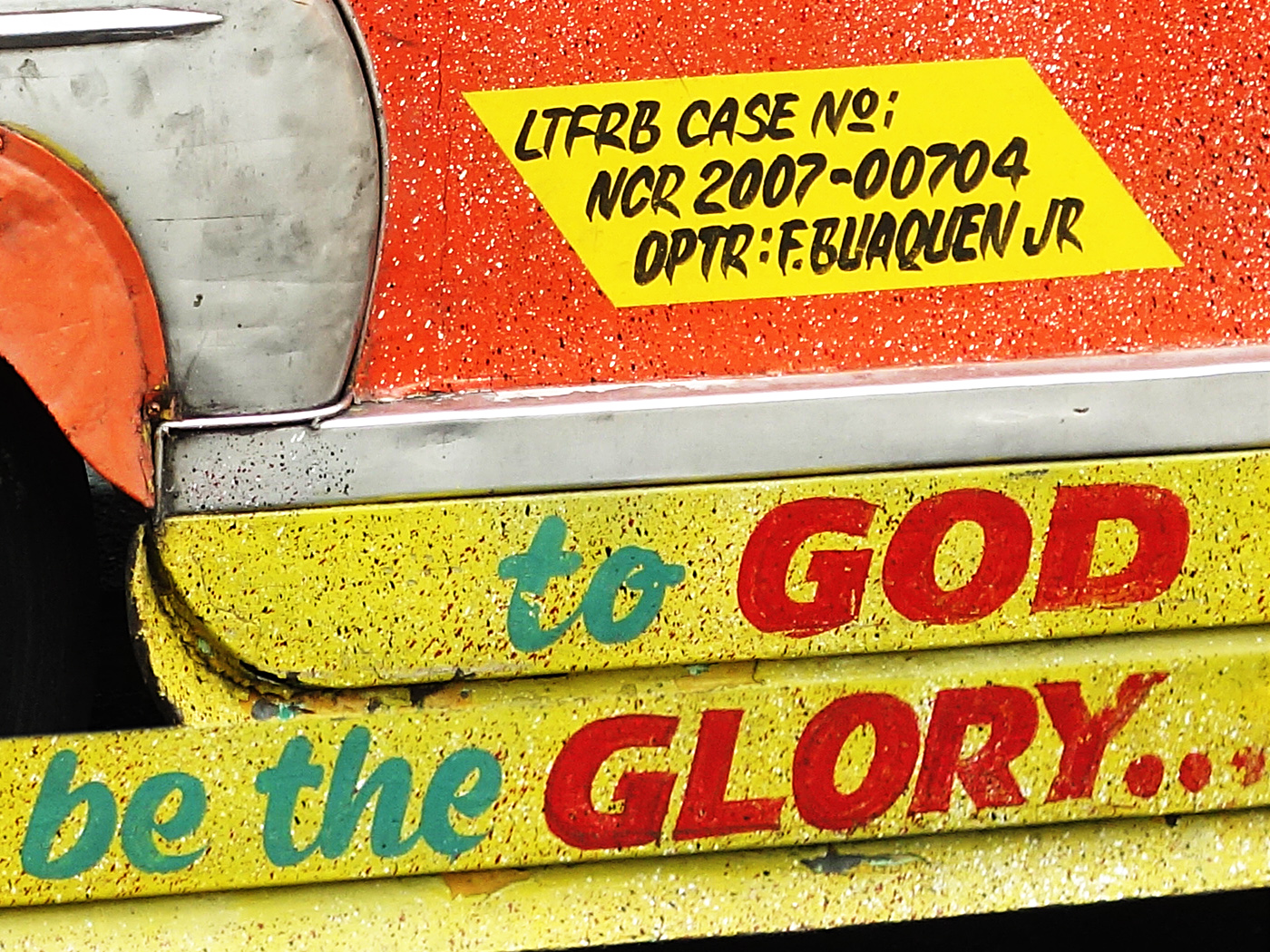
Do you think that hand-lettered signage has a place in Filipino art? Why?
Definitely. I’d take as evidence the people who’ve taken interest in it and contacted me through the site. I’ve seen images from Pancy Letter around the web and have also met and made new friends from it. Isias Canay contacted me when he was doing his thesis on the same subject but with a different medium and approach; Maan Agsalud of the recent exhibit Type Kita also got in touch. So there’s definitely an interest in it, and I think it will grow.
Any funny, touching, or simply memorable moments while doing this project?
I asked Manong Silverio (one of the artists) what he called the style that we was doing at that moment. He answered in an accent: “Ah, singel stroke, Pancy Letter.” And that’s where I got the name of the site. I feel like his accent when speaking English was a quaint metaphor for the Filipino flavor that comes out in the Latin Alphabet lettering we see around us. Manong Silverio has passed away, I heard from a friend, but he was the funniest to talk to among the interviewees.
What’s next for Pancy Letter? What should we look forward to?
I want to make more videos and articles for the site or at least make an album on Vimeo, probably through the production studio—Belle—that me and a friend have put up.
I also want the site cleaned up code-wise. I’m open to a complete overhaul if a dedicated web designer could do it better. I don’t exactly have time for all of it right now but I’m looking to partner with people in the seemingly growing community of letter lovers in our country. That means being part of the typographic community in general.
To see more of Carl’s work, visit his website here. For the meantime, check out our Three on Three with him!
Pancy Letter’s Three on Three
Top three fonts you love using
1. Adobe Garamond
2. Proxima Nova/Gotham/Neutraface
3. Brandon Grotesque
Top three Filipino street food you’ve tried
1. Fish balls
2. Tempura
3. MRT siomai
Top three things to do in a summer day
1. Go out to see the sun
2. Stay in to hide from the sun
3. Have ice cream or ice candy
Categories Art + Design

